Branding • 2021
In January of 2021, I redesigned the logo of the local arborist company Above Average Tree Removal and Hedge Trimming.
The primary purpose behind the rebrand was to update Above Average’s logo and website. Through this, I aimed to help Above Average expand their brand and grow their clientele.
In addition to a new logo, I created a branding guide, stationery, updated digital presence, as well as mockups.




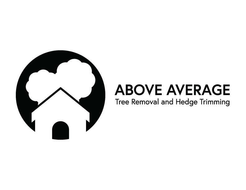
Designed with Above Average’s clientele and the local community in mind, the final emblem features a home and two trees. The reasoning behind this was to represent the company's care for their clientele and their homes.
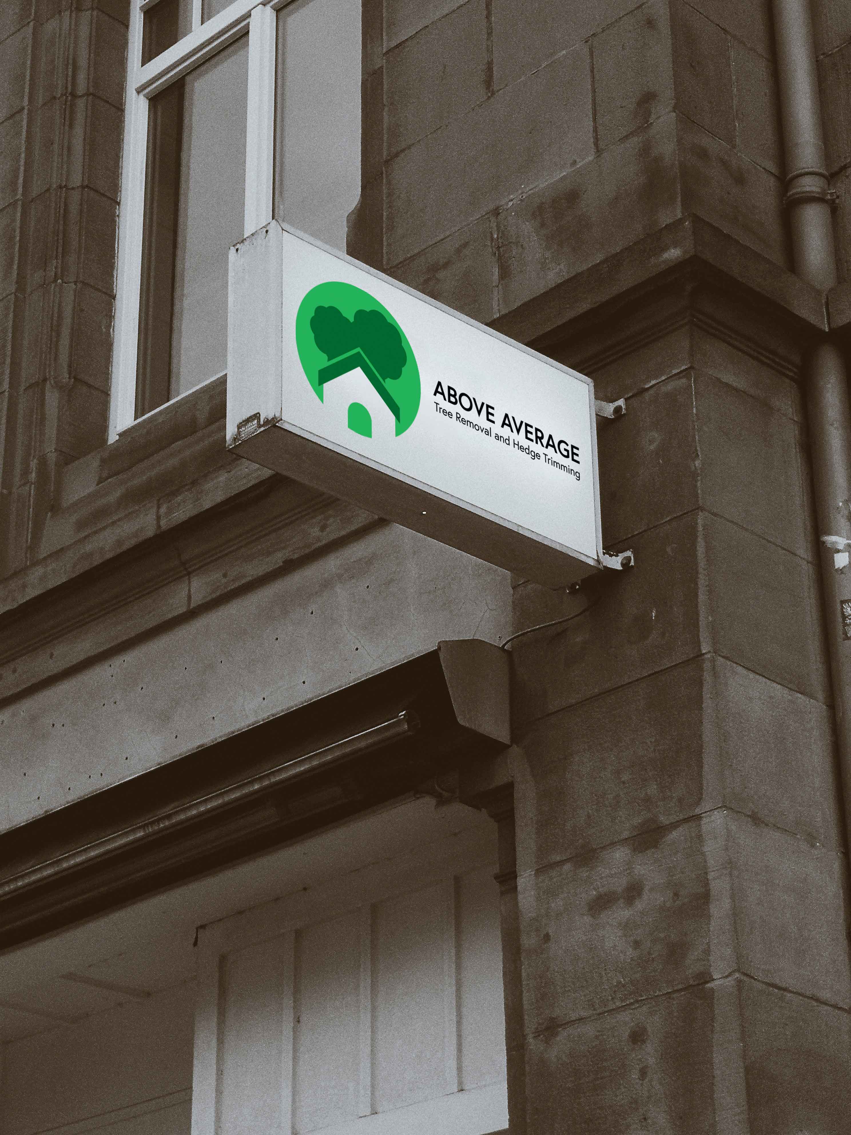
The new logo uses a green, two tone colour scheme. This colour palette was chosen to represent nature and growth, particularly Above Average's growth as a company.

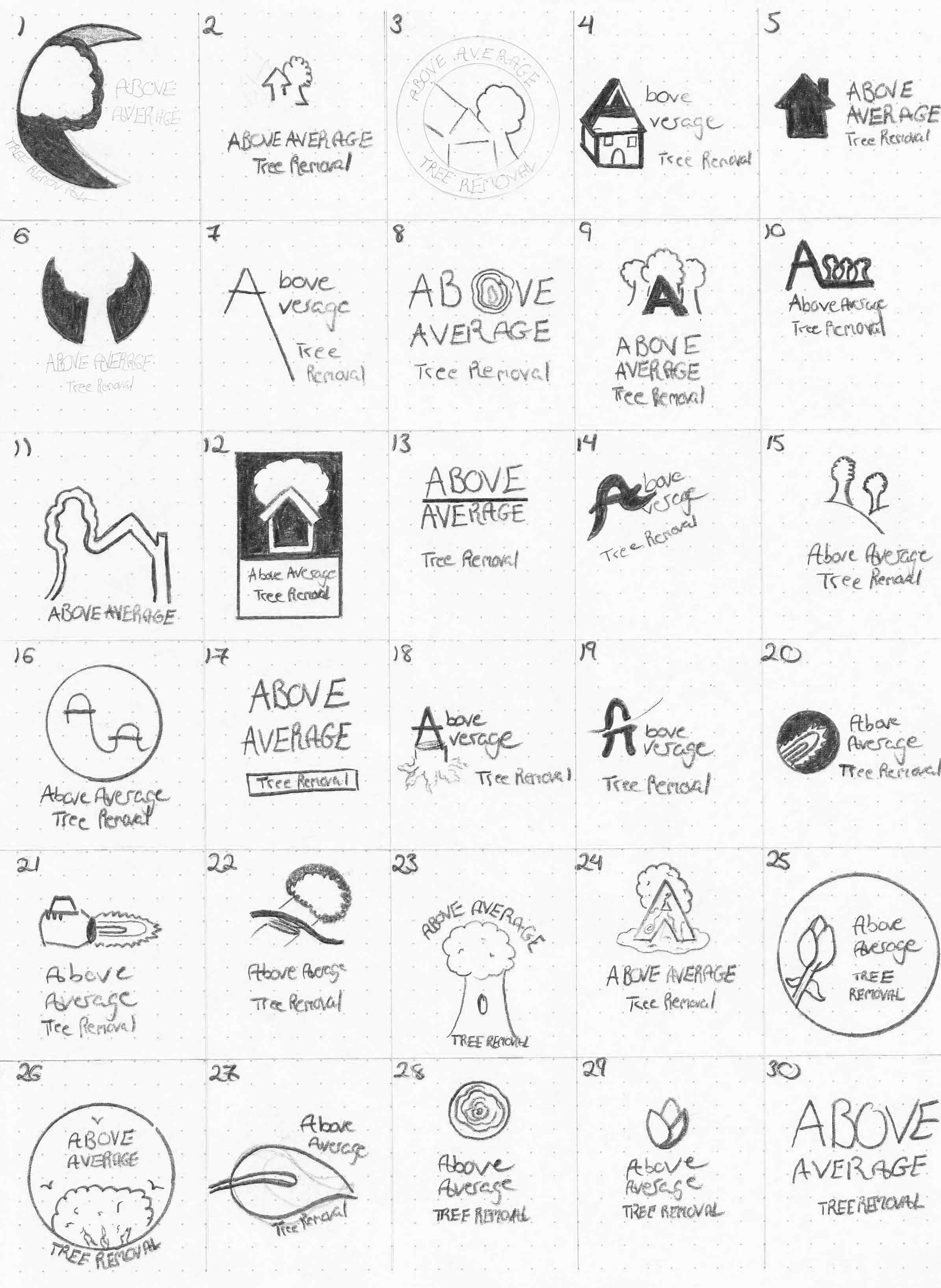
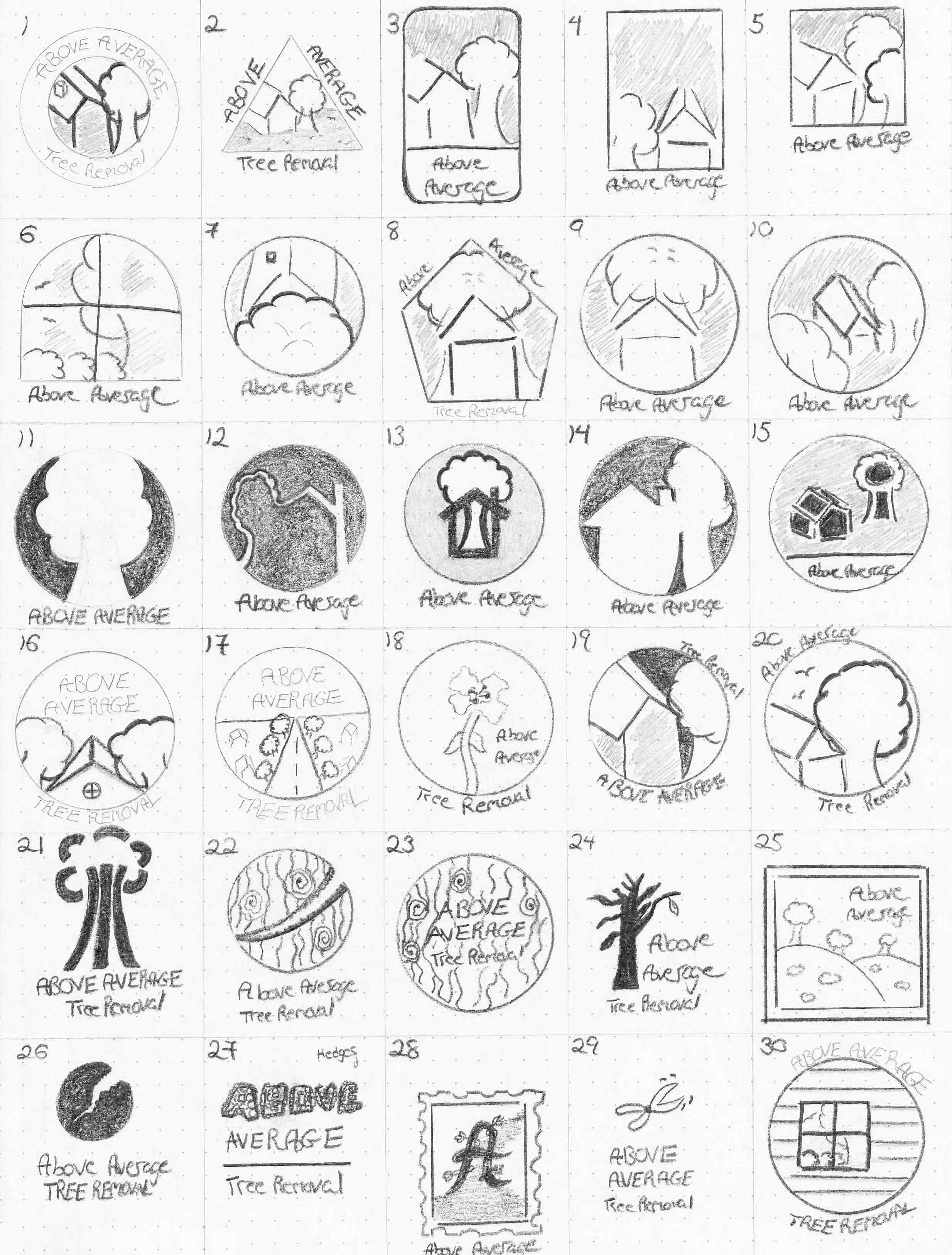
To start, I first conducted market research. From there I created a Pinterest board for inspiration and began sketching. For this project, I drew 60 sketches to ensure I exhausted every possible design.
By far the most challenging part of this project was nailing down the logo. After exploring multiple concepts and variations with these extensive sketches, I was able to land on the final design.
